


Project Name
Dependency Analyzer
Project Date
January 2019 – January 2020
Roles
Research
Benchmarking
Interaction Design
Visual Design
Icon Production
Prototyping
Project Context
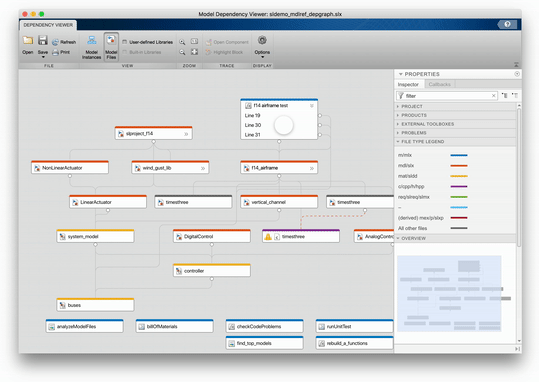
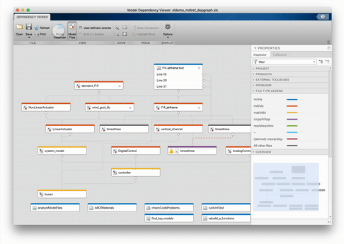
The Dependency Analyzer is used to explore the structure of a MATLAB project. The tool produces a diagram that allows users to analyze the file structure of a project, the project’s file dependencies, and how those file dependencies relate to each other. Users can apply filters to help investigate dependencies and review warnings about problem files, such as missing files or files not found in the project.
Project Motivation
We had multiple tools for viewing dependencies and the team was also preparing to transition from Java to Javascript. We wanted to take advantage of this work and update the design and interactions for the Dependency Analyzer. There were also a number of customer and internal reported bugs and enhancements that needed to be addressed during this time.
| Design Problems | Objectives |
| Customer and internal reported bugs and enhancements | Review bugs and enhancements and address these issues |
| Interactions and visual design need updating | Update design and functionality of the tool - review external benchmarks |
| Tool doesn't look or behave consistently with other diagram tools in MathWorks products | Create consistency with other MathWorks diagram products and refer to Visual Design Standards |
Research + Benchmarking
The Diagramming Tools We Started With
Part of the motivation for this project was to create a unified dependency viewer tool. Below, is a glimpse at screenshots of previous tools.
Customer and Internal User Pain Points
In the early research and benchmarking phase, previously reported issues with the current tools were reviewed to create a list of user pain points. The following is a sample of some of the issues that were found:
The colors of the different boxes can be misleading (the default colors for some line dependencies categories were an opposite meaning than the default colors for some file types)
Customer wanted to be able to click on a dependency type in the legend to filter results
When searching for a file, any files that aren’t associated with that text input are removed from the view, along with their connections to the rest of the project
The initial point of arrows in diagrams to show dependencies could be the same, rather than at different points on the same card
A user wanted to be able to select a specific dependency line and have an affordance to show this individual line from the others
Benchmarks
In the early research phases, I spent some time researching other dependency diagrams for a variety of content. Below are a few static examples.


Interaction Design
Diagram Layout + Zoom Levels
Process + Research
When considering the layout and how much content to show at different zoom levels, we looked at Google Maps for inspiration. We also knew that we wanted a file list view in a tabular format to support the diagram view, but not as the primary view for the tool.


Design Proposal
We considered what information a user is most interested in seeing in the diagram at three different levels of zoom. We wanted to make sure that we only showed users what they want to see, when they want to see it, to avoid cluttering the diagram. For the purposes of this case study, I’ll refer to these three different zoom levels as Zoom -1, Zoom 0, and Zoom +1. Below are some sketches that I started with, followed by hi-fi mocks.


Zoom -1
Default at the start of viewing the diagram to satisfy the use case of gaining an overview of the project
This is what is shown when the user does a fit-to-view action
File type cards are filled in with color that matches their file type category. We decided to go with shape of cards for consistency, but explored using smaller squares
Zoom 0
User can now see the file name and the file card category color is now a bar at the top of the card
Users can still do hover and selection interactions, but selection affordance has been modified, now that the file cards are no longer filled with color


Zoom +1
The file name is shown, along with the file type on the card
Dependency types can be seen on hover and selection of a line
Context of File Card and Dependency Line Selection
Design Proposal
My initial proposal was to gray out files that aren’t part of the path of a selected file at 35% opacity, as well as remove the dependency lines that weren’t part of the path of the selected file. The selected file or dependency line would also receive a standard affordance for selection that included a 1px blue outline around the file card (which you can view at zoom 0 above). The selection of the dependency line addressed an earlier mentioned pain point:
A user wanted to be able to select a specific dependency line and have an affordance to show this individual line from the others

Implementation
Once implemented, graying out the files, that were actually still connected and dependent on each other, felt confusing. Instead, we moved forward with three different Toolstrip options that could be made when a user selected a file. These options show all dependencies of a file, show files that need the selected file(s), and show files needed by the selected file(s). This behavior can be seen in the following GIF.

Searching for a File
Design Proposal
I created a prototype using Adobe XD to demonstrate the proposed search functionality, which would align with our product standards. When a user searches for a name, rather than eliminating results that don’t match, the matching results are highlighted in a dark yellow, for the currently selected search result, and secondary yellow, for all remaining results. The search functionality works in both the diagram and file list table. This proposal helps alleviate a previously mentioned pain point:
When searching for a file, any files that aren’t associated with that text input are removed from the view, along with their connections to the rest of the project

I also considered how searching works with the different levels of zoom that we were working on. For the zoom -1, the yellow highlight gets added around the file type cards as we don’t show text so far on zoom out. On zoom 0 and zoom +1, the matching text results would get highlighted in yellow.


Filtering Files from Diagram View
We added the functionality to create filter views in order to filter files to show only things like MATLAB files or class and model hierarchies. As we started working on this, the team thought, will users know that this is a subset of their data?
Prototyping
I started looking into different kinds of animations that we could do to show a transition of the diagram into a filter view. I created prototypes in Adobe XD and proposed three ideas to the development team.
Gray out the files that aren’t included in the filter view. This was similar to the initial proposal for showing file dependencies and a user could click transparent files to bring all back into view.
Since we originally moved forward with doing something similar to this idea for showing file dependencies, we didn’t go with this.

Animate individual files to come together and rearrange themselves.
The team felt like this was a little too overwhelming.
Show a loading bar, then a new graph with the filtered results. This idea felt slow and we didn’t want our users to feel like adding a filter was sluggish.
However, we did end up moving forward with something like this, just with a different progress indicator, since we expected there would be performance time with larger diagrams.
Feedback
During our internal interactive design review, we had questions and feedback come up:
The view change was confusing, am I filtering?
I couldn’t figure out how to clear the filters.
I can tell you’re using three different affordances (graying out boxes, yellow search highlight, filters, but not sure what’s going on or which filters have been applied.
We realized we weren’t giving the users any feedback about which filters had been applied, other than changing the view when a filter was chosen in the gallery. It wasn’t clear how many filters had been applied at the same time.
In a separate 1-click study, created and conducted by one of my team members using static images, users were asked these questions among a few others:
Display only Simulink model files in the Dependency Viewer
There are several files named “timesthree” in the project. How would you find out which one is a C Source file?
When asked these questions, many users tried interacting with the file type legend in a panel on the right-hand side of the diagram. Based on these results, we decided to make the legend interactive.

Revised Design
Based on the feedback that we heard during the internal interactive design review and 1-click study, we made some adjustments to our design.
We added filter nuggets, that appear as a user has applied some kind of filter to the diagram. The individual filter can be cleared from the view by clicking on the ‘x’ on the right-hand side of the nugget.
Checkboxes, to control which file types are in view, were added to the legend due to the amount of users that tried to interact with the legend. We also added the number of files that had been filtered from the view using the legend, above the legend, as well as numbers next to each file type to indicate how many of those files were in the diagram. This helped address a similar pain point mentioned earlier:
Customer wanted to be able to click on a dependency type in the legend to filter results


Visual Design
Card + Line Styles
Design Process
Originally I started with a pastel color palette like the old tool was using, but with a new style for the card. We moved the sub dependencies into the property inspector panel, but still wanted some affordance for how to show these. I considered a few options:
Putting a number on each file card to show how many dependencies there are
This felt like it could be more distracting than helpful, if it were shown on every card
Showing double/thicker dependencies lines to indicate sub dependencies
There could be confusion about how to convey that multiple dependency line types were included on one selection
Here’s an evolution of the different card and line styles that I experimented with at the three levels of zoom:


Design Proposal
Here’s what the final design proposal looked like at the three levels of zoom. We decided to show a tooltip with the file name, file type, and number of impacted or required files for that file being hovered on.
I transitioned to using a standard color palette for data and graphics, which MathWork’s Deep Network Designer was already using. This helped the new design of the tool feel more consistent with other diagram tools. We removed using color for the dependency lines, as users could gain this information in the property inspector panel, which addressed this pain point:
The colors of the different boxes can be misleading (the default colors for some line dependencies categories were an opposite meaning than the default colors for some file types)
I also cleaned up the lines of the diagram so that all of the dependency lines originated from the same initial point on a file card. The new lines are now easier to follow, match the style of Deep Network Designer, and address this internal reported enhancement:
The initial point of arrows in diagrams to show dependencies could be the same, rather than at different points on the same card
Final Design + Icons
Here’s a look at the final design at its current state of implementation, as well as icons that I produced for the Dependency Analyzer app.


Insights + Reflection
When You Know Better, Do Better
I started learning a lot about accessibility when I was working on this project. If I had known then what I know about WCAG and color contrast, the conflicting back-and-forth conversation about the background color may have been a lot simpler.
Take Time for Ideation + Exploration
One of the main reasons why I’m so proud of this project and why it was so successful is because we took time to research, benchmark, conceptualize, and discuss our design. I worked with a team in the United Kingdom, making me the only “remote” member of the team in the United States. This time zone distance did not limit our collaboration during any of the design phases, but rather enhanced our time together.
Apply What You’ve Learned in Other Places
After working on the Dependency Analyzer app, I identified that 10+ apps focusing on diagrams did not have a designer in the loop for their projects. I have since taken the opportunity and filled this gap by working with a development manager and the diagram app teams.