
Project Name
Build Results Database (BRDB)
Date
January–November 2018
Roles
Research
Interaction Design
Visual Design
Icon Production
Prototyping
Project Context
The purpose of this user interface is to allow software developers to review the results of the build phase of a code submittal. Ultimately, developers are looking for any failures that occurred during the build phase in order to take appropriate action. The interactivity of the table allows developers to identify who portions of code belong to, as well as assign gecks (tracked bugs) to fix to a specific developer. Users of this workflow include any developers that work on MathWorks product software.

User Workflow
One objective for this workflow is that a software developer would like to make changes to a specific area of code in the entire code base in order to develop a new feature for a product. The workflow begins with the developer making a clone to a portion of code, making some changes, then reviewing the code with another developer. Once the code has been reviewed, it is submitted to a build and test environment. BRDB (Build Results Database) presents developers with any failures to the build of the code before automatically advancing to TRDB (Test Results Database) upon passing. If all tests pass, the code is promoted to the larger code base before eventually being released in the latest version of the product.
| Design Problems | Objectives |
| No visual elements or cohesiveness | Update the look and feel of the BRDB |
| Inconsistent interactions/visual systems | Create a visual consistency within our IAT (Infrastructure and Tools) internal tools |
| Hard for designers or engineers to use tool | Standardize elements for easy implementation and future use and projects |
Design Process

Research
Internal Benchmarking
In the interest of maintaining visual design consistency within our internal tools, our team benchmarked and incorporated design elements from current internal UIs. We also did not have time to build a complete new design system, so we opted for introducing a few new components/elements.
Workflows
To provide a smooth transition for users after the redesign, changing entire user workflows was out-of-scope. Instead, we focused on changing certain interactions that occur within a workflow to improve usability.
Sketches
Design Decisions + User Impact
Increase Developer Productivity with Reduced Clicks
Rather than clicking each individual ‘x’ to delete each status icons, users will be able to click into the field and backspace
Users can choose criteria using checkboxes with an option to select all, rather than making individual selections with the dropdown closing after each selection
Previous design
Current design
User Recognition over Recollection
Created a new layout for forms to provide users with better visual context and allow them to refer to rows in the table while completing a relevant task
Organized the use of vertical and horizontal space for forms, rather than always having them appear above the table and push down rows of information
Previous design
Current design
Focused Decision Making
Present alert messages as modals rather than above the table and pushing down rows of information
Lead users to focus on the action that they are about to take and prevent errors
Previous design – Inline message at top of table
Current design – Modal pop-up alert message
Visual Consistency + Accessibility
Represent hyperlink text using a blue color to match users mental model, as well as avoid using colors that do not have high enough contrast
Update row selection color to match row selection affordances in other internal UIs
Previous design
Current design
Prototype + Usability Sessions
Using hi-fi mocks, I created this prototype with Invision for usability sessions with internal MathWorks participants. This workflow includes the task of associating a geck, or an issue, to a build result. Five different prototypes were created to cover all tasks.
Example workflow included in usability sessions
For the usability sessions, we wanted to gather feedback on the interactions of the UI and measure the aesthetic appeal. After users completed tasks, we asked them to use a scale of 1 (not at all) to 7 (very much) to rate the design in relevance to the following words:
• Modern
• Intuitive
• Clean
• Functional
• Improvement
• Frustrated
• Confusing
• Inconsistent
• Unsightly
• Cluttered
• Discoverable
Data Analysis + User Feedback
The UX specialist and a member of the UX metrics analyzed the data that was gathered from the usability sessions to conclude that the proposed UI rated higher than the current UI concerning aesthetic appeal. We also received positive feedback regarding opening the form on the right to give the user a more contextual view, toast notifications for user feedback, and new abilities to select in dropdown menus. Additional feedback and improvements for future releases included user role specific layouts for the form, holistic view of all items being deleted, and inline editing.
Specs + Implementation
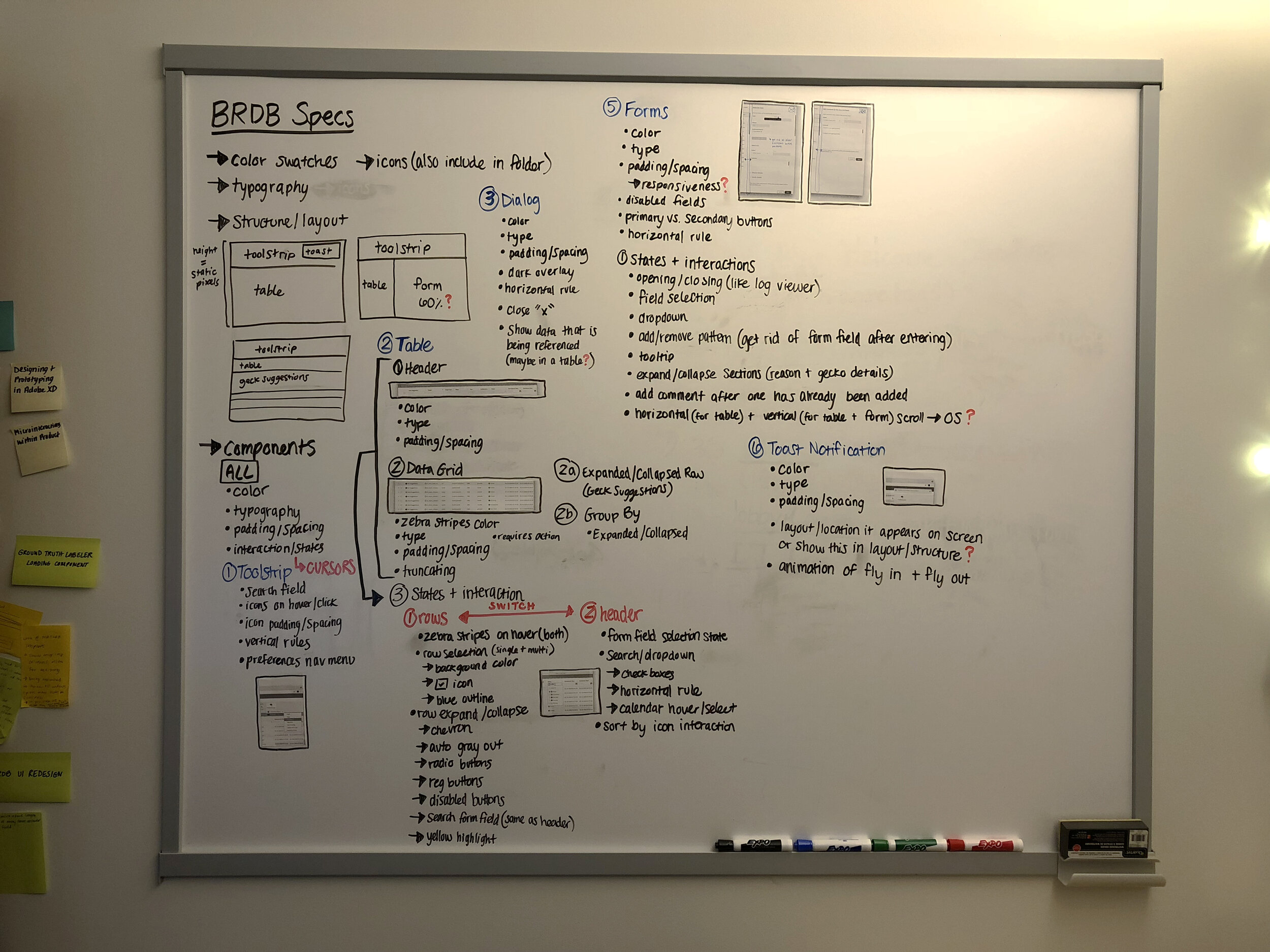
Following the usability session, specs were created to help with the implementation process. I worked back and forth with the development team to ensure that specs were implemented. These specs informed the design of other internal applications and helped to promote design consistency. Before completing the spec digitally, I brainstormed all of the aspects that I wanted to include on a whiteboard.
Pushback + Constraints
One of the initial constraints the team faced when this project started was that the BRDB UI was not built on the same framework as the other internal tools that were benchmarked. Due to this constraint, I had to choose a font stack, inspect that all spacing values and components were consistent.
I received pushback from the team about changing all hyperlinks to be blue, rather than a combination of red, yellow, orange, blue, or purple, which were being used to represent the status of a build result. I recommended that we change the the hyperlinks to blue for three reasons:
To ensure that all hyperlink colors were consistent and received the same affordance
To match a user’s mental model for a perceived link color that is commonly used
To promote accessibility as using yellow for a link color was not a high contrast ratio against a white background and was difficult to read
I was able to persuade the team to move forward and use blue for hyperlinks with the above reasoning. We agreed that if user feedback arose surrounding the change, we would revisit the discussion.
Final Design
Below is a before and after of the BRDB UI. The left side is a screenshot taken at the start of the project, while the right side is the final design.


| Design Problems | Objectives | Design Solutions |
| No visual elements or cohesiveness | Update the look and feel of the BRDB | Designed a more modern and cleaner UI |
| Inconsistent interactions/visual systems | Create visual and interaction consistency within our IAT (Infrastructure and Tools) internal tools | Alleviated pain points with improved user interactions tested during usability sessions |
| Hard for designers or engineers to maintain style of all individual internal tools | Standardize elements for easy implementation and future use and projects | Created a spec that documented visual style for components and interactions that will be used to create other internal tools |
Insights + Reflection
Design Process
Throughout the process of designing the BRDB UI, I loved focusing on both visual and interaction design of the user’s workflow. Those key moments of coming up with a design that solves a problem, often something as small as a checkbox, to help improve user pain points feel rewarding.
People
This project showed me the value of working with a cross-functional team and how our knowledge crosses over. At the time, I was mentoring a design intern that I was able to review design concepts with, as well as other members of the product visual design team. I worked with UX specialists to provide input for the tasks for the usability sessions and learn more about usability studies. Finally, I worked closely with members of the development team to learn more about constraints and implementation processes.
Future Design Work
Working on the UI sparked a conversation with other designers around creating design systems. I observed the value in creating standardized components and elements to improve the consistency of product. This led to my involvement in the creation of Product Visual Design Standards at MathWorks.